Tuesday, 16 September 2008

Max Ernst

ernst
'Une Semaine de Bonte'.

'Une Semaine de Bonte', or, 'A Week of Kindness', was first published by Ernst in Paris as a set of pamphlets during the 1930s. Constituted of found imagery from Victorian encyclopedias and novels, there are 182 surreal montages to the series.

I am a big fan of ol' Ernst, particularly 'Une Semaine'. I like how he plays traditional Victorian imagery against itself, arising from sources otherwise considered serious, the adaptation of context through montage gives the images a new lease of life.

Saturday, 6 September 2008

Archigram

archigram
'Hotel'.

I first came across Archigram in the book 'Summer of Love: Art of the Psychedelic Era' that accompanied the 2005 exhibition of the same name, at Tate Liverpool.
A group of young architects who met in the early 1960s, they started the publication Archigram (architectural telegram) where they recorded schemes inspired by their discussions the architectural scene of the time. After their second publication, they started work at a Euston office with another set of architects, which culminated in an exhibition in 1963, 'Living City', at the ICA.
In the chapter that discusses the work of Archigram in 'Summer of Love', Barry Curtis describes how 'an advanced technological society can look like anything', such a point can be seen in Archigram's schemes.

I really like the saturated colours, and the contrasts between the collage and the drawn imagery. There is a strange sense of movement in the image, similar to that of a film still or a photograph.

Jan Tschichold

jan

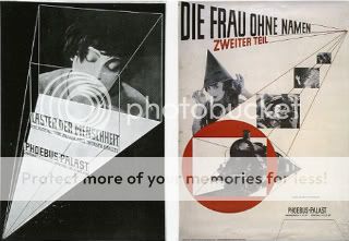
Heavily influenced by the Bauhaus, Tschichold was a leading typographer of the 20th Century. He wrote ' Die Neue Typographie', a manifesto of modern design, where he condemned all fonts but sans serif, a postulation he later dismissed, along with Modernist design as a whole, as 'authoritarian and inherantly fascistic', opting rather for neo-classical design.

Tschichold's 'The Form of the Book' gave explanations of ways to divide a page into aesthetically strong proportions. The above images are evidential of his preoccupation with principles of page construction.

Friday, 5 September 2008

Maths Man.

math man

A friend who I did foundation with found this in a 1970s maths journal, if he had been my maths teacher, I would be a better mathematician than Pythagoras ever was, or at least i'd be able to do long division.

Telephone Ladies.

telephone ladies
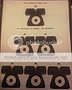
This image was on the back cover of Dot Dot Dot magazine (issue 16).

I like how it takes a few seconds to realise it isn't just lots of old telephones, but also oriental ladies in kimonos. The text reads: 'The declaration of acting a part, the desperation of imitation, the brutalizing torment of brutalization and of saying the same thing over and over again'.

Wednesday, 3 September 2008

Polly Becker

Polly Becker
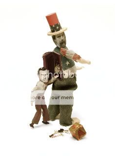
Illustration for 'The State of the Union' in The Atlantic Monthly.


Becker's assemblages have a 'Blue Peter' charm about them, primarily, they seem quite aesthetically clumsy but on closer inspection you can tell that a lot of time and skill has gone into each piece.

Their stances and facial expressions are really amusing.

Maria Rivans

Greetings from Bournemouth
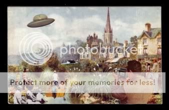
'Greetings from Bournemouth'.

Rivans uses a base print that is then built upon with additional elements creating a 'pop-up' like image that only really comes through in live viewing. I came across her work at Inkd, a local ( Brighton ) gallery, i like the meticulous attention to detail in her work.

Charlie Duck

Charlie Duck

Charlie Duck
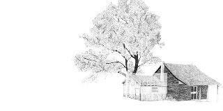
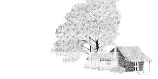
'Outside'.

Charlie Duck is a recent Illustration graduate from the University of Brighton, these are two of his illustrations from the 'Outside' series, taken from a book he created in response to a Marshall McLuhan quote, 'everybody experiences far more than he understands, yet it is experience rather than understanding which influences behaviour'.

I like the subtle progression from the first image to the second, I also think that his graphite skills are pretty impressive.

Peter Blake

Peter Blake
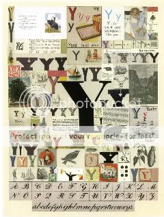
'An Alphabet' by Peter Blake, 'Y'.

Blake's 'Alphabet', a series of silkscreen prints, indulges his fascination with letters, fonts and typography. In the press release for the exhibition of the prints held at the Paul Stolper Gallery in East London last November Blake tells of his love for lists and 'things that have a beginning and a very specific ending', which the alphabet certainly does.

I find the repetition throughout the series and within each print quite exciting, I think I might be a bit OCD.

Monday, 1 September 2008

Gustav Zander

gym


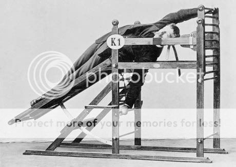
I found this image in the 'Sloth' issue of Cabinet magazine, the article 'The Origins of Cybex Space' detailed Gustav Zander's Stockholm institute, founded in the late nineteenth century, where he treated children and male workers for physical impairments brought about by accidents of birth and hard labour. Zander's machines were the result of his argument that 'progressive exertion' was more effective than the popular cures of the time, such as acrobatics.

I really enjoy the way the man is holding such an awkward position but retaining a very serious face, almost as if it was normal practice during the 1800s to remain at a diagonal at all times.